

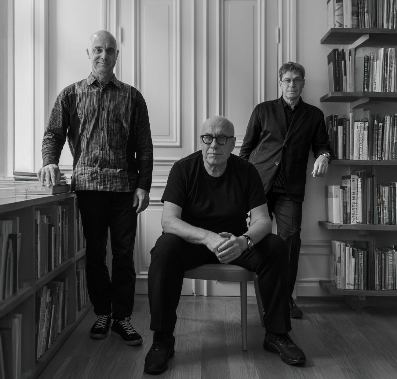
In November, what is about to become one of Sweden's most exciting watch traditions was presented: Who has been made this year's Sjöö Sandström Annual Edition? When the announcement comes in, it feels like the Stock Exchange building when this year's Nobel Prize is presented. In 2025, the answer is design and architect trio Claesson Koivisto Rune, which makes us exclaim: ”"Finally!"”
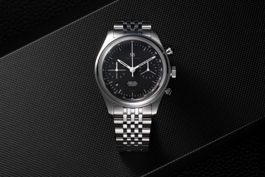
MARTEN CLAESSON, Eero Koivisto and Ola Rune are obsessed with details. Which is one reason why the design and architecture firm Claesson Koivisto Rune is getting more and more assignments in the watch world. It is also an excellent attitude when you are going to remake an existing model in 86 copies, which flirts with 1986, the year Sjöö Sandström was founded. For this year's Sjöö Sandström Annual Edition – the seventh in a row – the design trio has taken on Royal Steel Chronograph, which has received a thorough facelift. Literally speaking, as the regular dial has sunken subdials. In Claesson Koivisto Rune's matte black version, the dial instead has a level, where precise lines, and a new font demonstrates the power of minimalism.
One of the major changes is that the date display has been given a new, round shape and has been moved to the corresponding position at 7.24, which according to Kristofer Johansson at Sjöö Sandström "harmonizes with the lines on the dial, since the arm is not straight when you look at the dial."”
– We like the slight asymmetry that occurs when the date is angled towards one. It's very stylish, plus it dissolves the vertical line that occurs with the date window at six o'clock, says Eero Koivisto to Voyage.
– We also wanted to mark 86 on the watch somehow, and Mårten figured out that we can do it on the tachymeter, he continues about the peripheral scale that can be used to measure speeds.
What else have the trio done with the Royal Steel Chronograph, the original model of which arrived in spring 2025? They have a new font, and on the subdials they have removed the numbers. Instead, they work with white symbols, lines and new hands for a pure clarity.
– The dial is like an architectural blueprint – all information has a purpose; there is nothing that is there unnecessarily,
explains Eero.
Claesson Koivisto Rune has also taken on the colors of the chronograph buttons. The start/stop button at two o’clock has a white line in luminescent SuperLuminova®, and the reset button at four o’clock has a black line. The result of the crisp graphic approach is a minimalist chronograph with the same aura as a dark suit.
“The design of the watch balances the fine line between elegance and function. And that’s what we wanted to create: a dressy chronograph that works both when you’re out sailing and at a fancy event,” says Eero.
Since Sjöö Sandström has several Japanese fans, the physical launch of the Annual Edition took place in Tokyo with Mårten Claesson Eero Koivisto and Ola Rune on site. The reception has been overwhelming both in Japan and in Scandinavia. And if tradition is followed, you have to be quick – Sjöö
Sandström Annual Edition usually sells out in a short time.
SJÖÖ SANDSTROM ANNUAL EDITION 2025
Designer: Claesson Koivisto Rune
Size: Ø 40mm, thickness 14.95 millimeters
Material: Stainless steel
Function: Time, date, chronograph
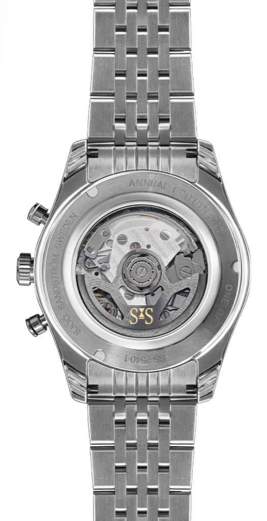
Clockwork: Automatic SS G17 (Swiss Made.)
Power reserve: 62 hours Limited edition: 86 copies.
Price: SEK 56,500 with steel bracelet, SEK 54,100 with rubber bracelet